
Data Visualization Making Sense of Big Data

Data Visualization Making Sense of Big Data
In 2017 The Economist published an article with the header: The World’s Most Valuable Resource is no Longer Oil, but Data. Data in its raw form isn’t valuable, however. It’s not until it is made intelligible and can be used to see patterns and make predictions that its value is realized. And this is where data visualization is playing a growing role.
What Is Data Visualization
Data visualization is a simple but powerful tool that has the ability to cut through complex amounts of data analysis in a succinct, manageable way by graphical representation. According to an article on data visualization, a large part of the human brain is devoted to vision— “as much as 80% of sensory input is processed by the visual pathway.” Using this vital sense we can more easily interpret data, making its conclusions more quickly and easily accessible.
Communicating Visually
Our human eyes are drawn to colors and patterns and this in turn can help us more quickly comprehend information. The visual organization of graphs or charts can neatly display in a small space what might take pages and pages to communicate in words. In a research study, graphic organizers such as charts or graphs, improved student performance in retention, reading comprehension, thinking and learning skills and critical thinking. But conveying large amounts of data in a two dimensional sphere is challenging and has to be done well to be effective. That’s where the 5 step model comes in.
5 Step Model
Creating good data visualization material from start to finish requires organization and can be broken down into 5 steps:
- In phase one a target or question is selected with the intention of using data to find an answer.
- The next step is data sorting, which can be done much more quickly and effectively with the assistance of artificial intelligence to identify patterns and similarities in data sets, this is especially true when dealing with Big Data. This phase gets the data into an understandable format.
- The third step is about designing the story that needs to be told or the question that should be answered with the data. This is closely linked back to the target defined in step 1. The types of graphs or charts to be used to communicate data findings can be selected here.
- Phase four involves using programming of interactive visualizations that use D3 to bring the data visualization to life. (D3.js is a JavaScript library for creating custom interactive data visualizations in the web browser using SVG, HTML and CSS.) This part of the process uses coding and some software knowledge.
- The fifth and final stage is a review of the data visualization piece that has been created. Here it can be decided if the graphical representation of data has answered the question posed in step one and communicated the data in an accurate visual manner.
A Job Well Done
Let’s take a look at a few graphic depictions of information that are well executed.
We’ll start with a famous illustration that mastefully depicts six types of data in two dimensions. The historical graph depicts Napoleon’s army departing the Polish-Russian border and their advances and retreats to Moscow. The Napoleonic army’s size is also displayed at various geographic points. This particular graph displays six types of data in two dimensions: the number of Napoleon’s troops; distance traveled; temperature; latitude and longitude; the direction of travel; and location relative to specific dates.
Graph from: https://towardsdatascience.com/the-power-of-visualization-in-data-science-1995d56e4208
Another beautiful example is the near-floral visualization that interactively looks at the US Trade Deficit from 2001 – 2013 by month. The moving visual shows the top 20 trading partners for both imports and exports. This graph was created with publicly available information.
Graph from: http://www.brightpointinc.com/united-states-trade-deficit/
Lastly, The graph below details gun deaths in 2013 and the approximate number of years lost per individual in each tragic gun death. It’s clearly impactful as each line represents a life lost.
Graph from: https://guns.periscopic.com/?year=2013
Why Graphical Representation Matters More Today
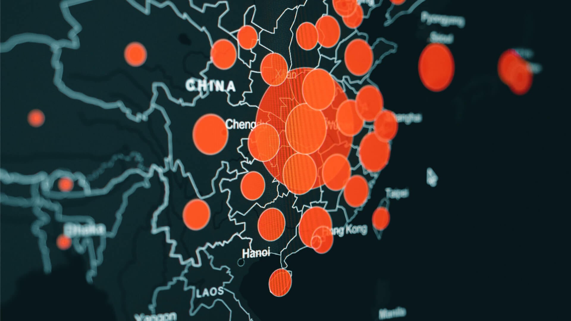
In our current day and age, Big Data is growing both in its volume and its usages. More and more we are storing and gathering data from vast pools of information. Data Visualization is an increasingly important tool to make sense of and manage the trillions of rows of data generated every single day. With the massive amount of data being generated, communicating this information is getting difficult. But data visualization is coming to the rescue.
Let’s take, as an example the healthcare industry who deals with incredible amounts of data in its search to ameliorate human health. Health organizations have begun to create custom graphs and charts for data. These visualizations are also interactive according to the data that the client wishes to see. You can see a sample chart here. The chart allows you to input data searching for patterns and trends and can be searched by both cause of death and risk. It’s a quick and impactful way to communicate to patients information about their particular health situation.
In cases with large amounts of data, with just a few key details being communicated, data visualizations are ideal. This is often the case when looking at healthcare on a state-by-state level or a local versus federal level where the information of interest is only a small part of a bigger picture. As an example, see this interactive visualization on child vaccinations in America.
Conclusion
Data visualization helps to tell stories by curating data into a form that is simplified and easy to digest. This has become all the more important with the rise of Big Data. With so much data available, it is critical to be able to succinctly and rapidly communicate specific information. Graphical representations are becoming one of the primary communicators across industries for their ability to easily highlight trends and outliers.
Save this link to your bookmarks to access the best free online web developr tools: html-css-js.com. I hope it will help a lot!